Flowdi — For the moments when you enter a flow state
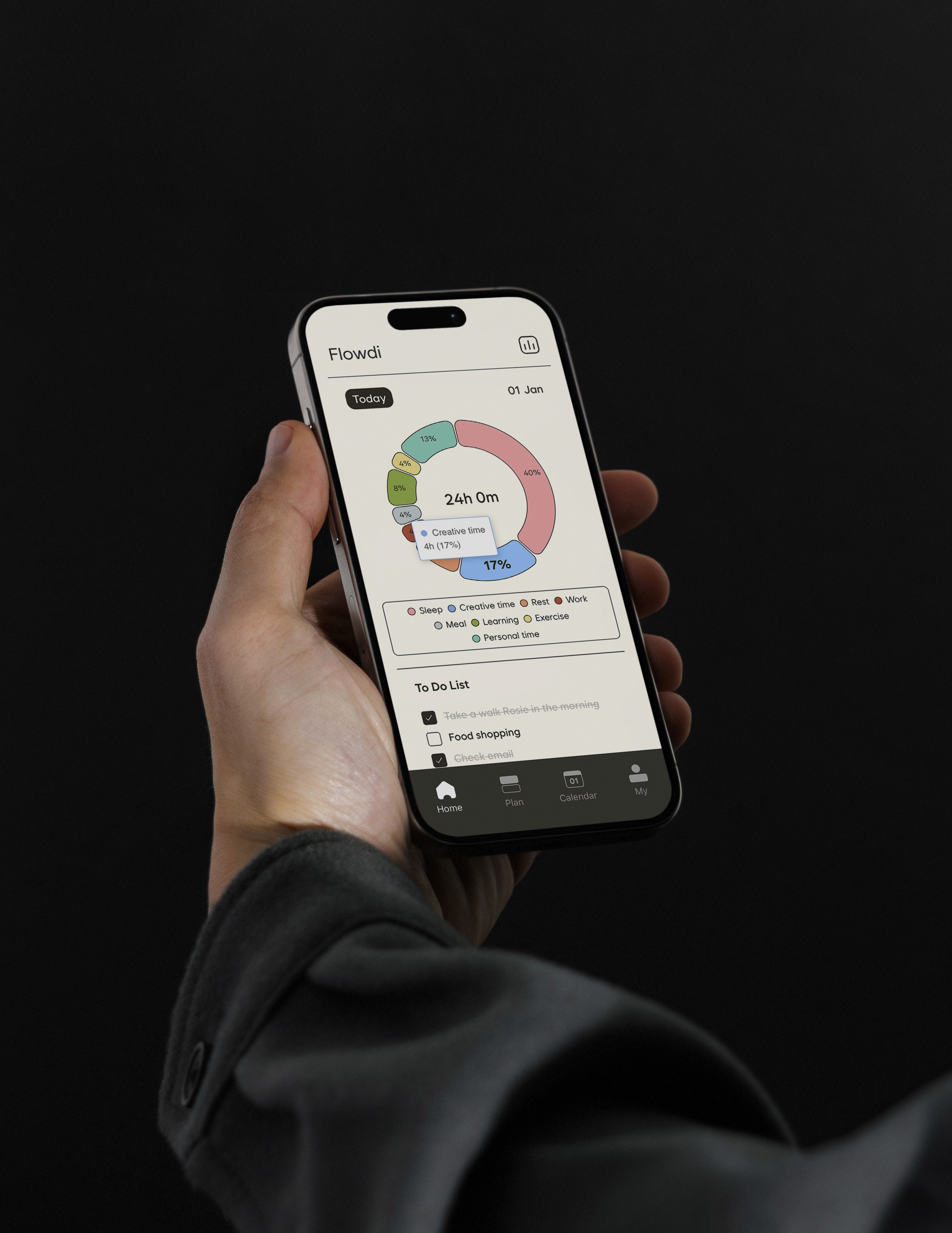
Flowdi is a time reflection app that visualizes how your time flows.
Project Overview
Flowdi is a collaborative design exploration on how visual and emotional design can make time more tangible and self-aware.
Built from scratch by a three-person team with a planner, a designer, and a developer, I led the end-to-end design process, from concept ideation and UX design to branding, motion, and launch on the App Store.
It redefines time tracking, not as a tool for productivity, but as a reflection of how we live and what we value.
The name “Flowdi”, a blend of flow and diary, captures this idea — a gentle flow of time, recorded with awareness rather than control.
Type
Team project
Duration
2025.08 – 2025.12
(5 months)
Role
Product Designer (End-to-End: UX/UI · Branding · Motion)
Tool
Figma, After Effects, Photoshop, Framer
Deliverables
UX Flow, Interactive Prototype, Brand Identity, Marketing Visuals
What it is
Flowdi is a time reflection app that visualizes how your time flows.
We often spend our most valuable resource, time, without realizing how it flows.
I wondered: Where is my time going?
Just as a financial statement reveals how money is spent,
Flowdi aims to create a “time statement”, a visual record of our hours that helps us recognize unconscious priorities and regain direction.
Why it exists
Most time-tracking tools focus on efficiency, but awareness often comes last.
Flowdi was built to help people see where their time truly goes.
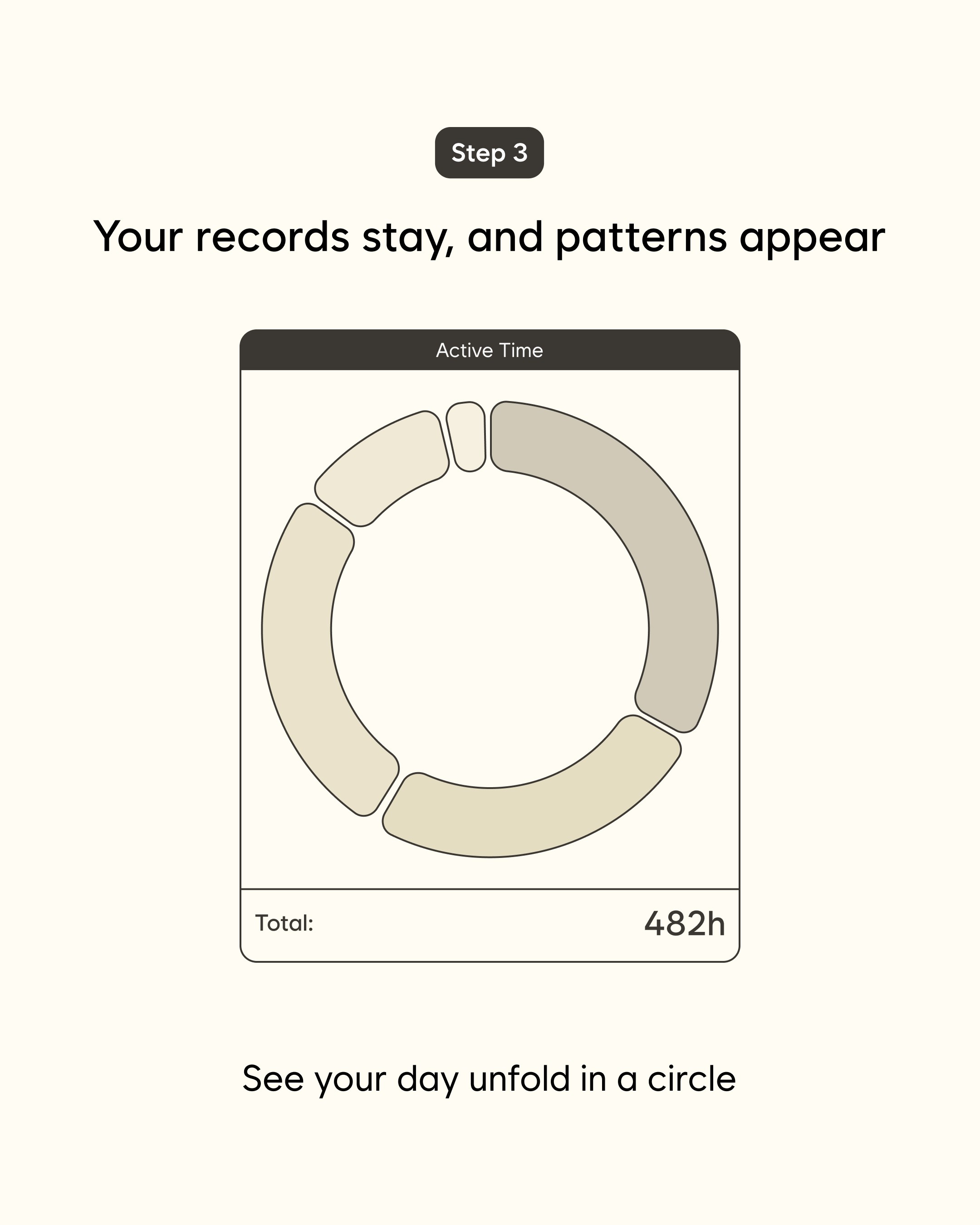
Visual language — Calm, minimal, and intuitively structured
When translating the analog warmth of paper diaries into digital form, I focused on keeping only what felt essential.
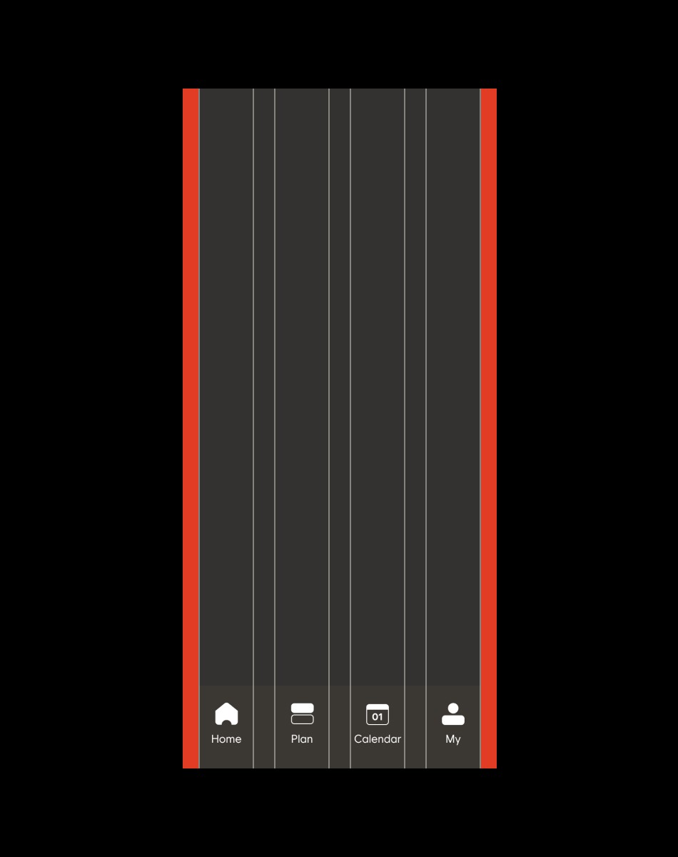
Like an e-book, Flowdi strips away the unnecessary — using calm colors, clean grids, and tactile gestures so that recording feels natural, not like a task.



Design Challenges
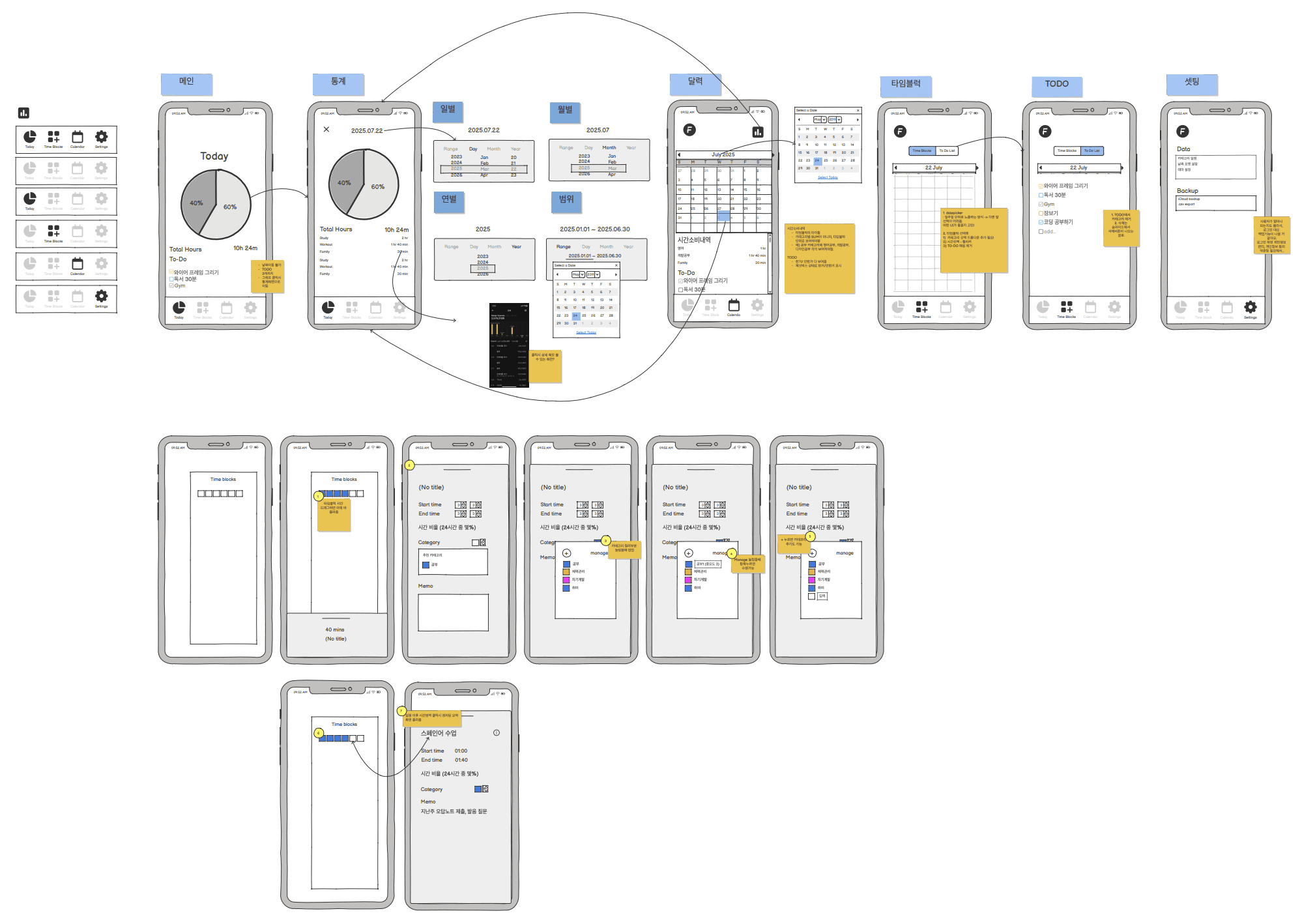
While defining the wireframes, our focus wasn’t only on visual clarity,
we questioned how each interaction would actually feel in daily use.
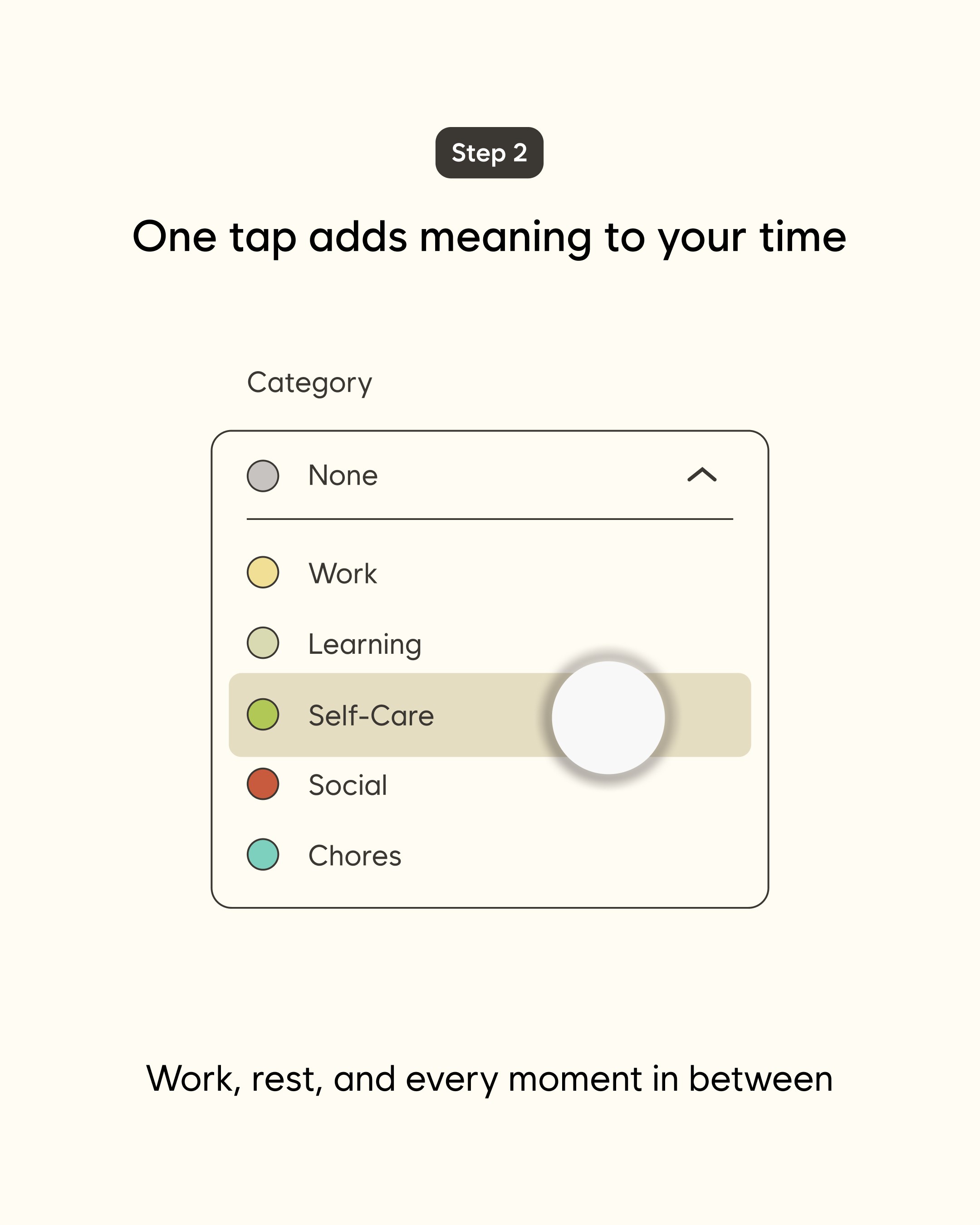
From navigation logic to category hierarchy, every detail was designed to make recording time intuitive and habitual.
Challenge 01 — Logging felt like a chore
Situation
Time-tracking apps struggle to keep users. Among free productivity apps on the App Store, median Day-28 retention is around 6%, so a typical app loses about 94 in 100 users within a month (App Store Connect peer benchmarks, 2026). My hypothesis was that logging time feels repetitive and tiring, so people simply stop reopening the app.
Task
Make recording so effortless that it becomes a natural habit.
Action
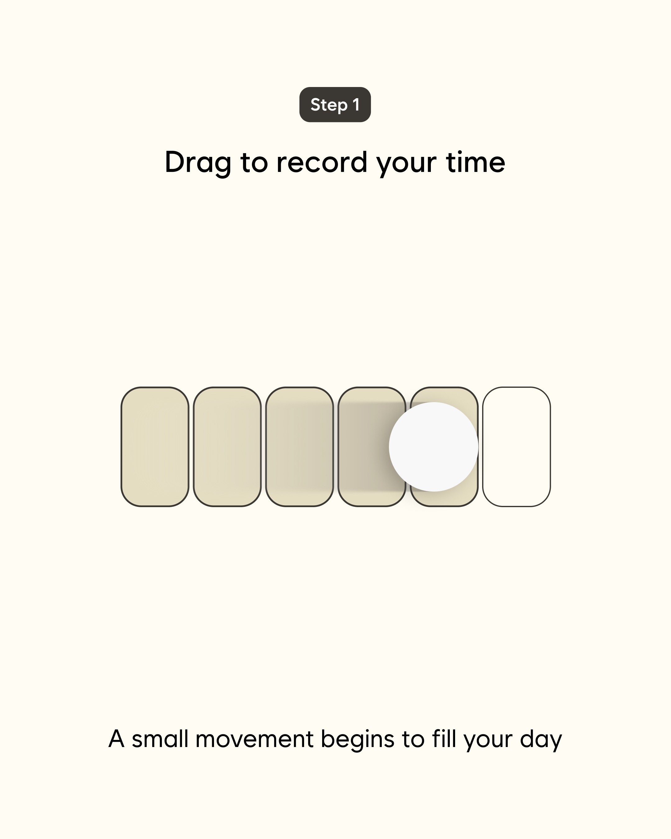
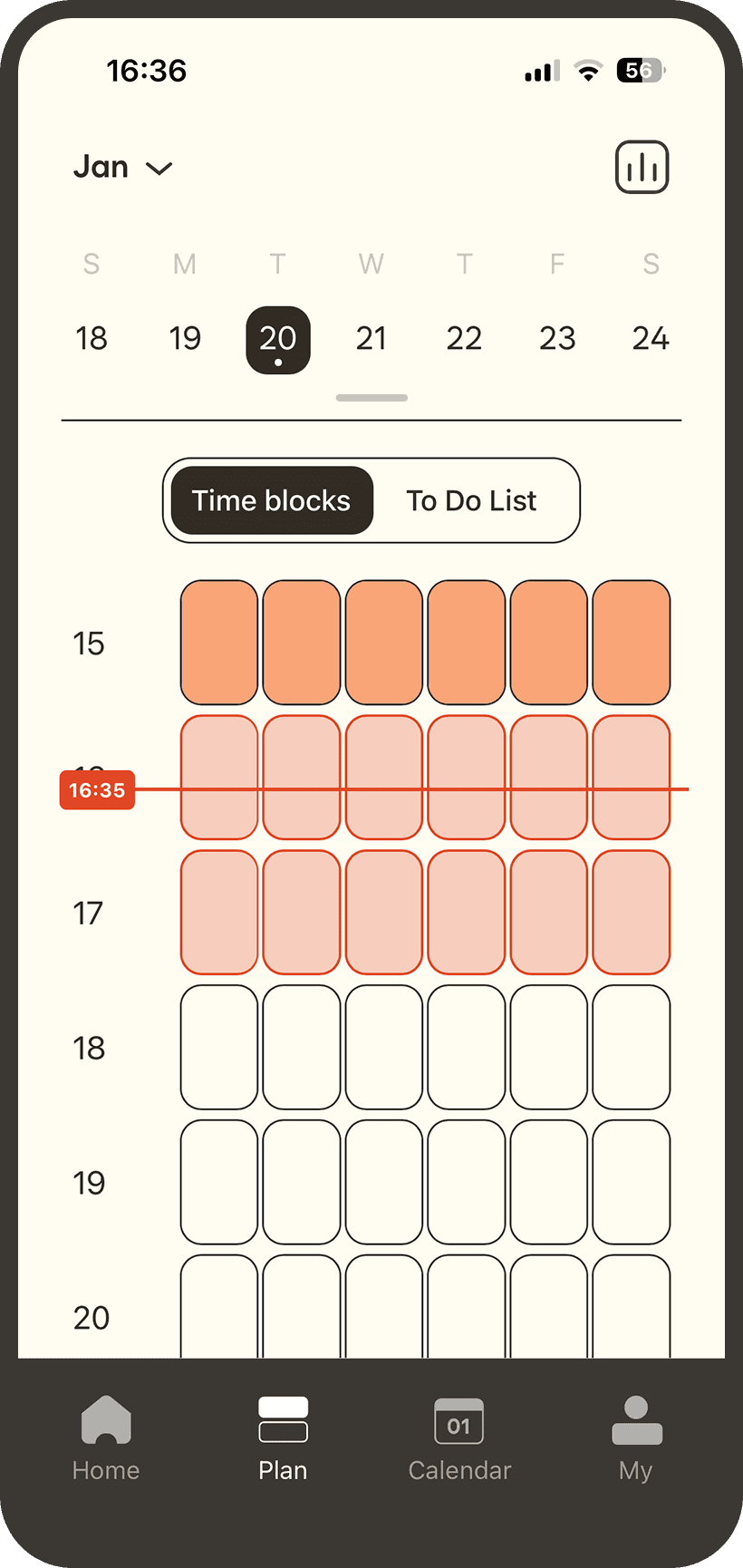
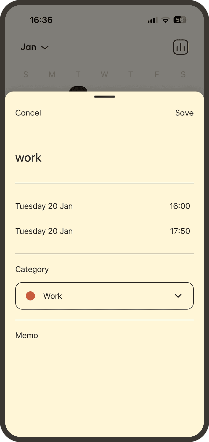
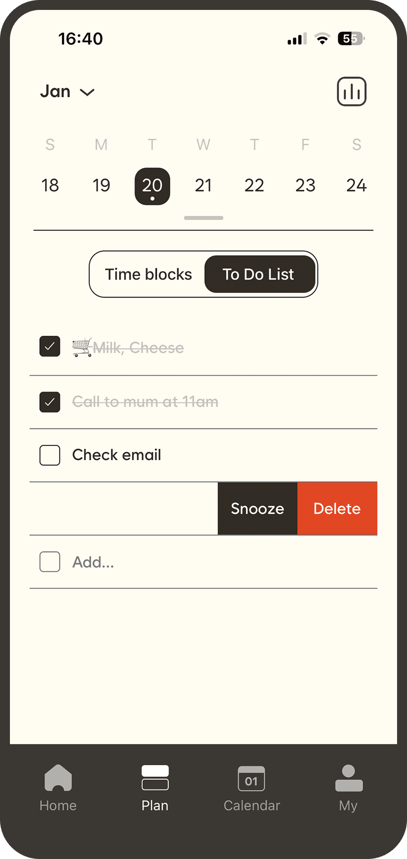
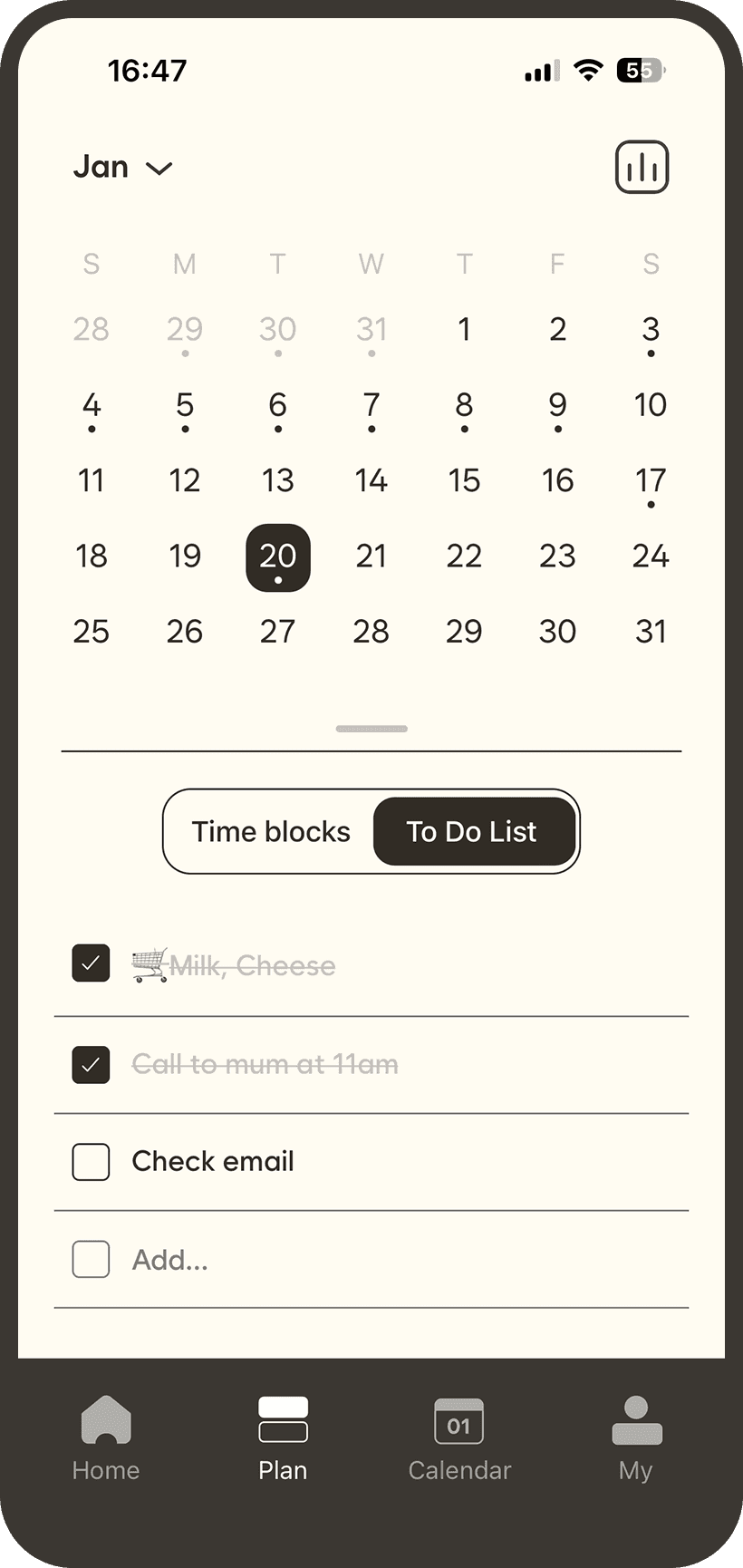
Introduced drag-based time blocks and separated to-do lists from the time planner to minimize input steps and cognitive load.
What changed in the build
Logging a block now takes a single drag, instead of opening a form and entering start and end times.
Challenge 02 — Defining the Scope of Time
Situation
During planning, we debated whether to include sleep or other passive hours as part of a user’s daily record.
Task
Clarify Flowdi’s purpose — should it represent all time, or only intentional time?
Action
We decided to exclude sleep and passive hours,
keeping Flowdi focused on chosen, active moments — the time users can truly reflect on.
What changed in the build
Flowdi visualizes intentional time — the part of life users can shape, not just spend.
Challenge 03 — From Numbers to Awareness
Challenge 03
— From Numbers to Awareness
Situation
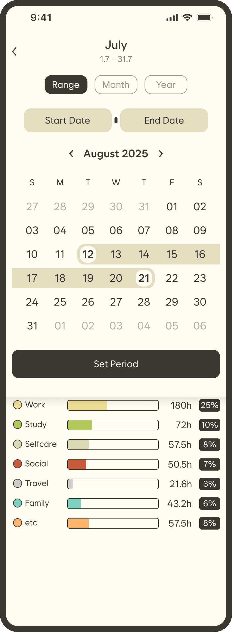
Most time apps summarize usage in charts or bars — users see how long, not how they lived.
Task
Help users understand patterns, not just totals.
Action
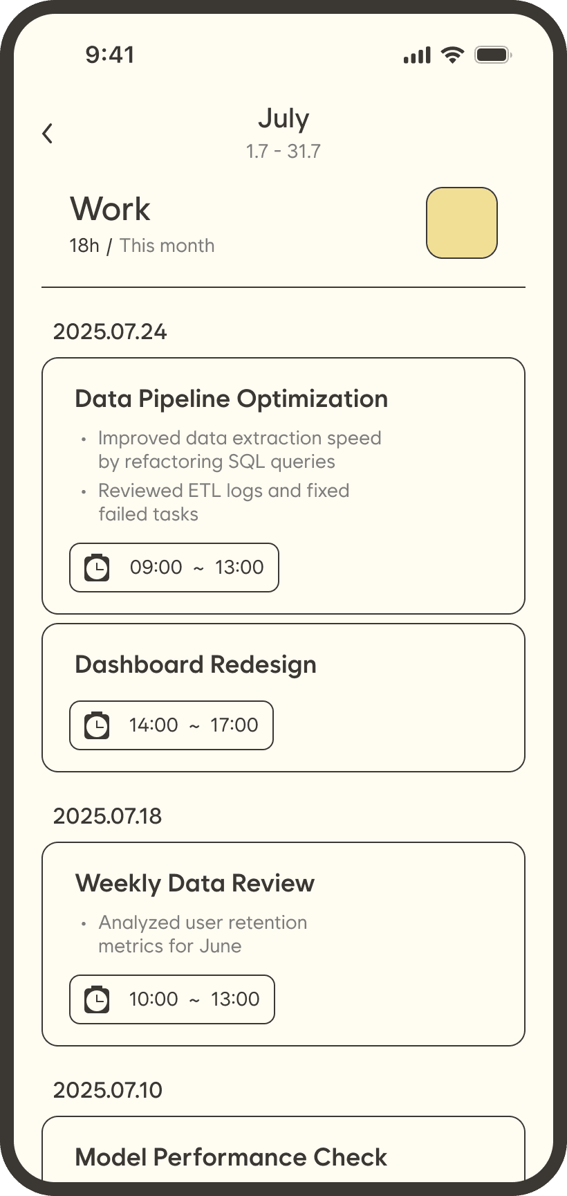
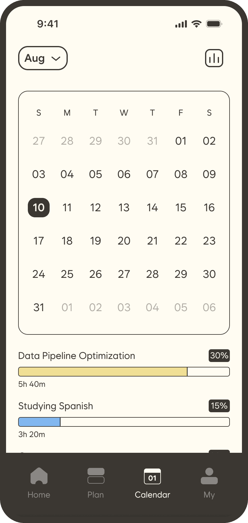
Built a Stats page that layers circular visualizations and expandable details.
What changed in the build
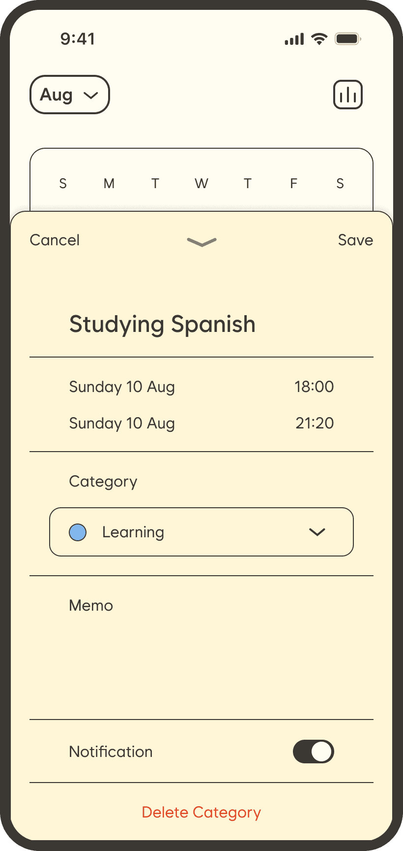
The Stats page shows each category as a ring, with tap-to-expand detail for any day.
Launch
Shipped to the App Store in January 2026. 180+ organic downloads to date, with no paid promotion.
Post-launch iteration
Challenge 03
— From Numbers to Awareness
After launch, I used Flowdi daily to plan my own work and asked several friends to use it too. Two friction points came up repeatedly, both in my own use and in their feedback, so I designed fixes for both, which we shipped in the next update.
1. Wasted scrolling on the timeline
Challenge 03
— From Numbers to Awareness
Observation
My day starts at 7am, yet every time I planned time blocks I had to scroll past midnight to 6am first. Anyone with a fixed routine hits the same empty hours.
Change
Added a setting to choose the hours the timeline starts and ends.
Impact
Removes up to 7 hours of empty blocks from every planning session, so planning starts where the day actually starts.
Before & After
Before
The timeline always opens at midnight.
After
1-Users set a start and end time. Blocks outside the range are hidden, not deleted.
2-The timeline now opens at 7am.


Before & After
Before
The timeline always opens at midnight.
The timeline always opens at midnight.
After
1-Users set a start and end time. Blocks outside the range are hidden, not deleted.
2-The timeline now opens at 7am.
2. Carried-over to-dos with no way to prioritise
Challenge 03
— From Numbers to Awareness
Observation
Completed and open tasks sat together in one list, and anything unfinished stayed on the day it was created. To keep going the next morning, users had to re-enter tasks by hand, and there was no way to put the most important ones first.
Change
Completed tasks now move into a separate Done list, unfinished ones roll over to the next day automatically, and any task can be reordered by drag.
Impact
Each day opens with only what’s still left to do, in the order that matters today, with no re-entry needed.
Before & After
Before
Completed and open tasks mixed in one list.
Completed and open tasks mixed in one list.

After
1-Completed tasks move to a separate list.
2-Tap Edit to reorder tasks by drag.


Before & After
Before
Completed and open tasks mixed in one list.
After
1-Completed tasks move to a separate list.
2-Tap Edit to reorder tasks by drag.
What I’d do next
I checked App Store Analytics to validate these changes, but there weren’t enough opted-in users for retention data to show. With a small user base, my next step would be qualitative: five moderated usability sessions with people who time-block their day.
Alongside that, I’d add in-app analytics to track time-to-first-block and how often rolled-over tasks get reordered.