LG U+ Notification Inbox Redesign
A lightweight redesign to improve clarity and usability of the notification list.
Project Overview
A focused redesign of the LG U+ notification inbox to clarify its identity, unify entry points, and structure messages for easier navigation and self-service. The updated experience enables users to find relevant information faster and complete key tasks directly within the app.
Type
Team project
Duration
2023.05 – 2023.06
(1 months)
Role
Product Designer (End-to-End: Research · UX/UI )
Tool
Figma
Deliverables
UX Flow, UI design
Team project
Type
2023.05 – 2023.06
(1 months)
Duration
Role
Product Designer (End-to-End: Research · UX/UI )
Figma
Tool
Deliverables
UX Flow, UI design
Problem 1
Problem 1
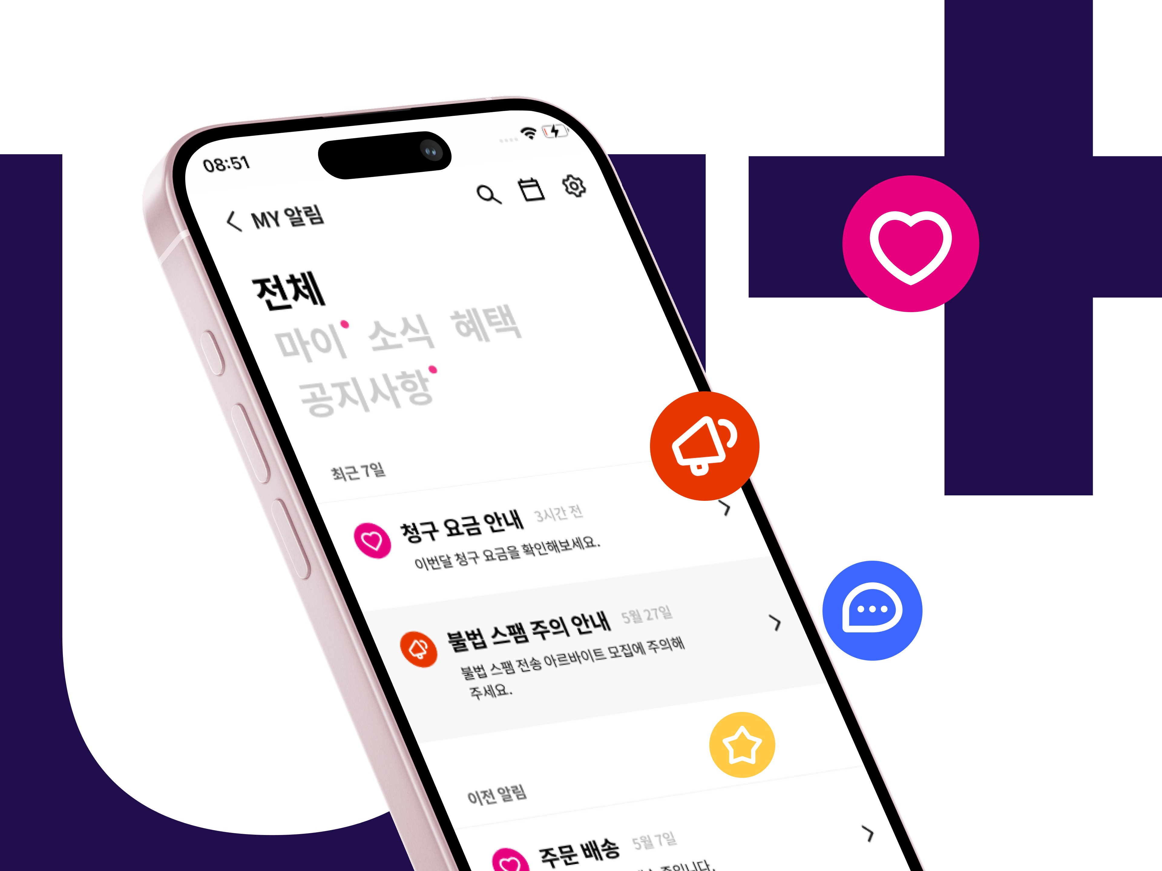
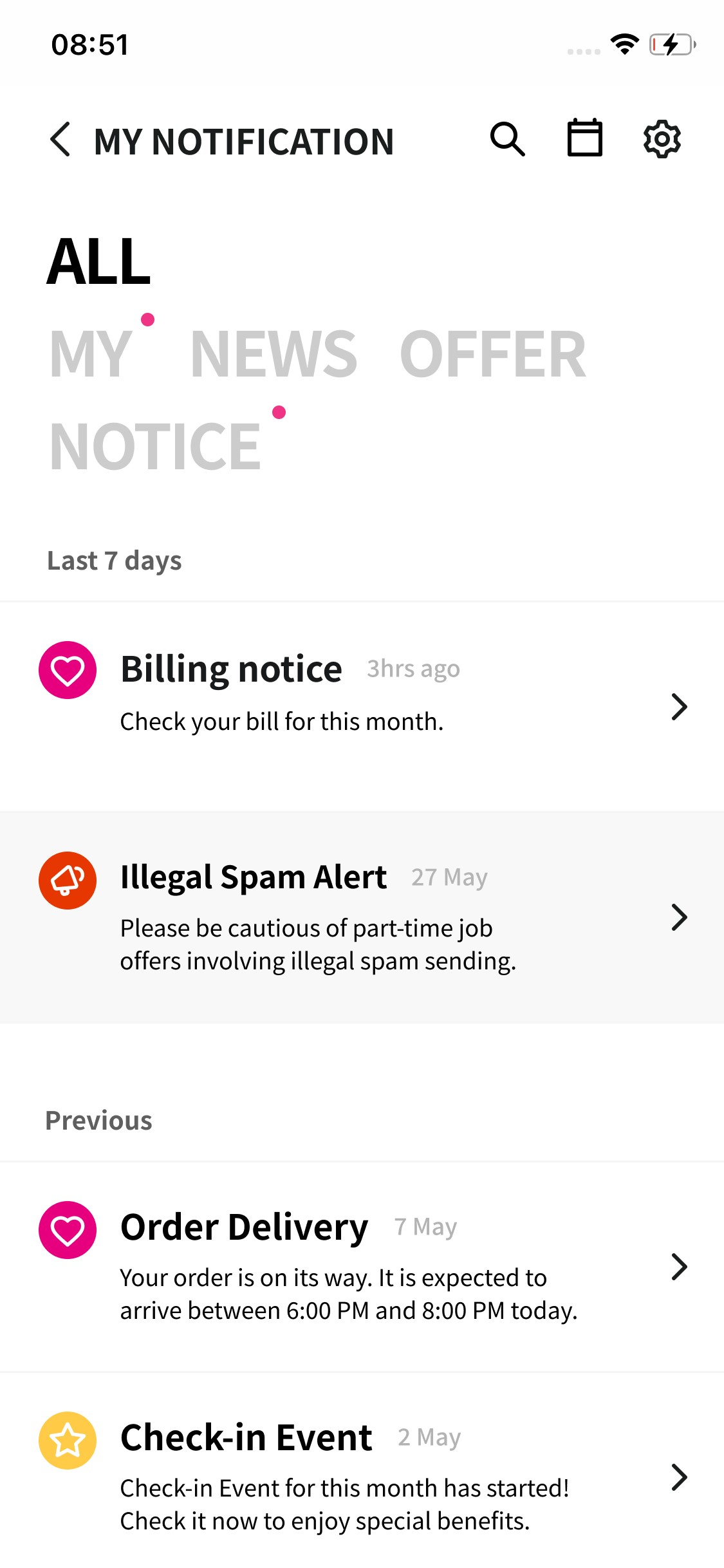
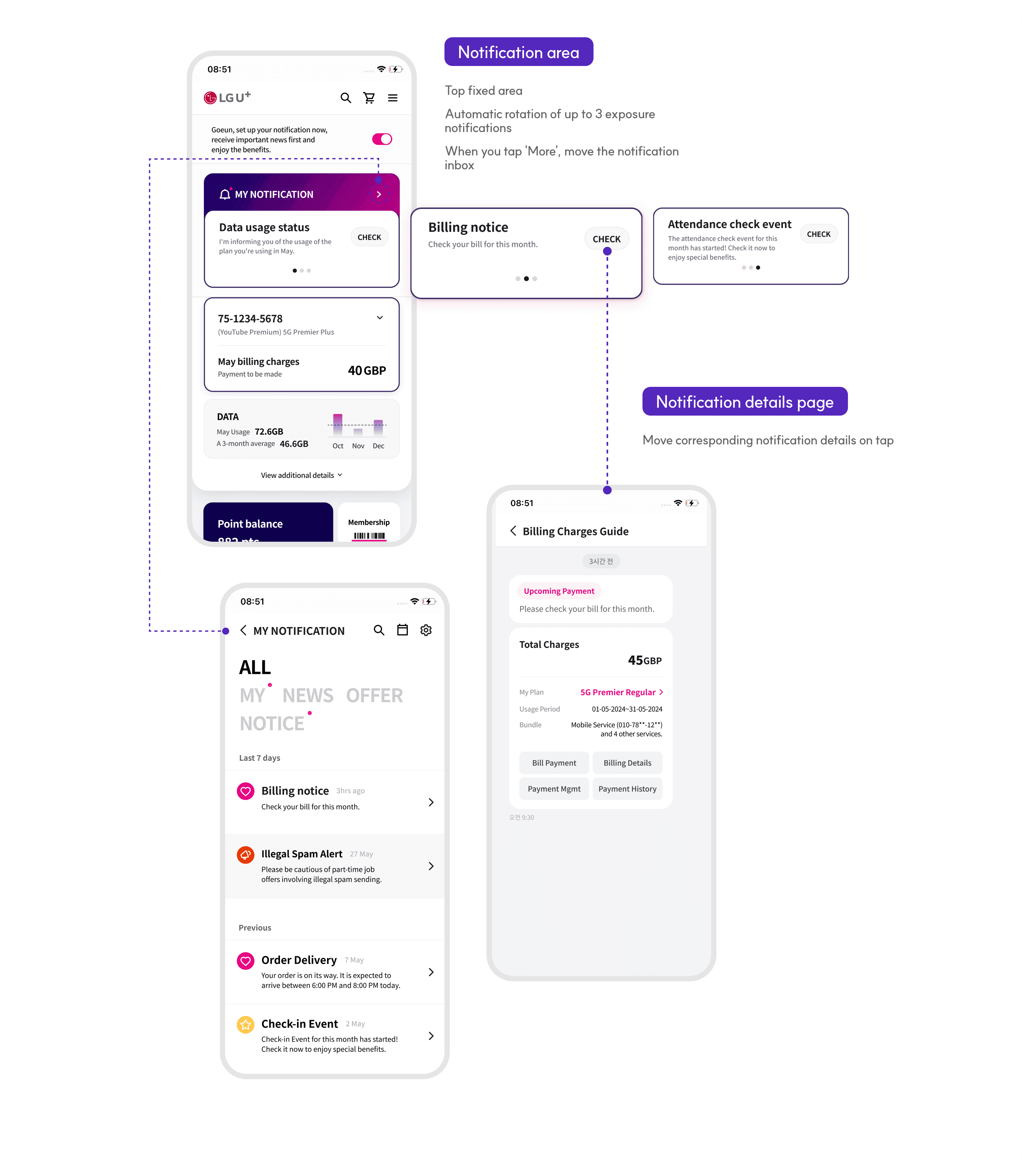
Not recognisable as a notification inbox
Not recognisable as a notification inbox
The page was not immediately recognisable as a notification inbox, making its purpose unclear.
Solution 1
Clarified the inbox identity
Clarified the inbox identity
Refined the layout and visual cues to make the page immediately recognisable as a notification inbox, strengthening its functional clarity.
Problem 2
Problem 2
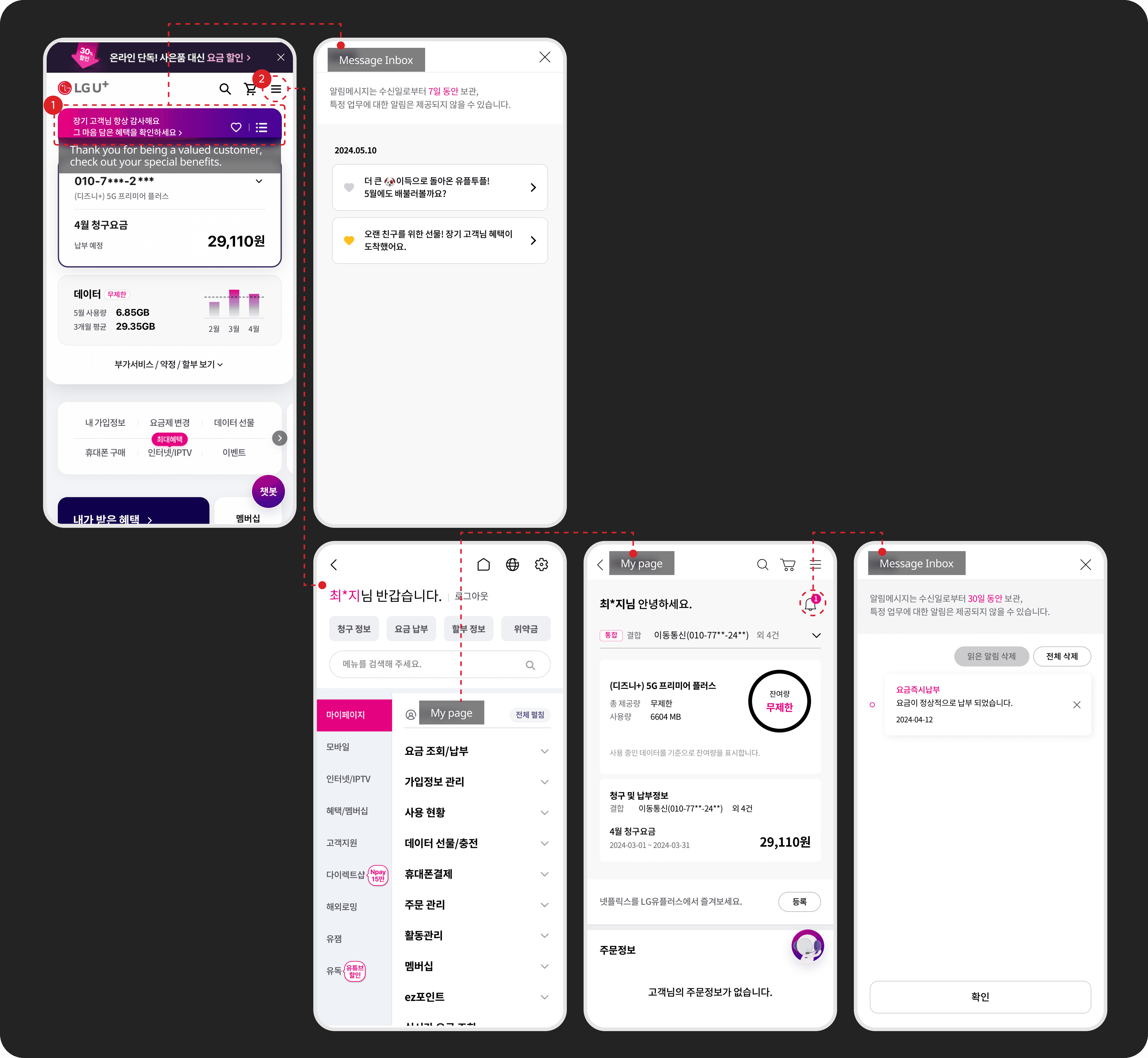
Multiple entry points caused confusion
Multiple entry points caused confusion
The inbox had multiple entry points across the app, causing confusion about whether they led to the same function.
Solution 2
Unified the notification entry point
Unified the notification entry point
Consolidated the notification inbox into a single entry point and standardised its naming, enabling a consistent and predictable access flow.
Problem 3
Problem 3
Uniform list made it hard to identify key information
Uniform list made it hard to identify
key information
Uniform list made it hard to identify
key information
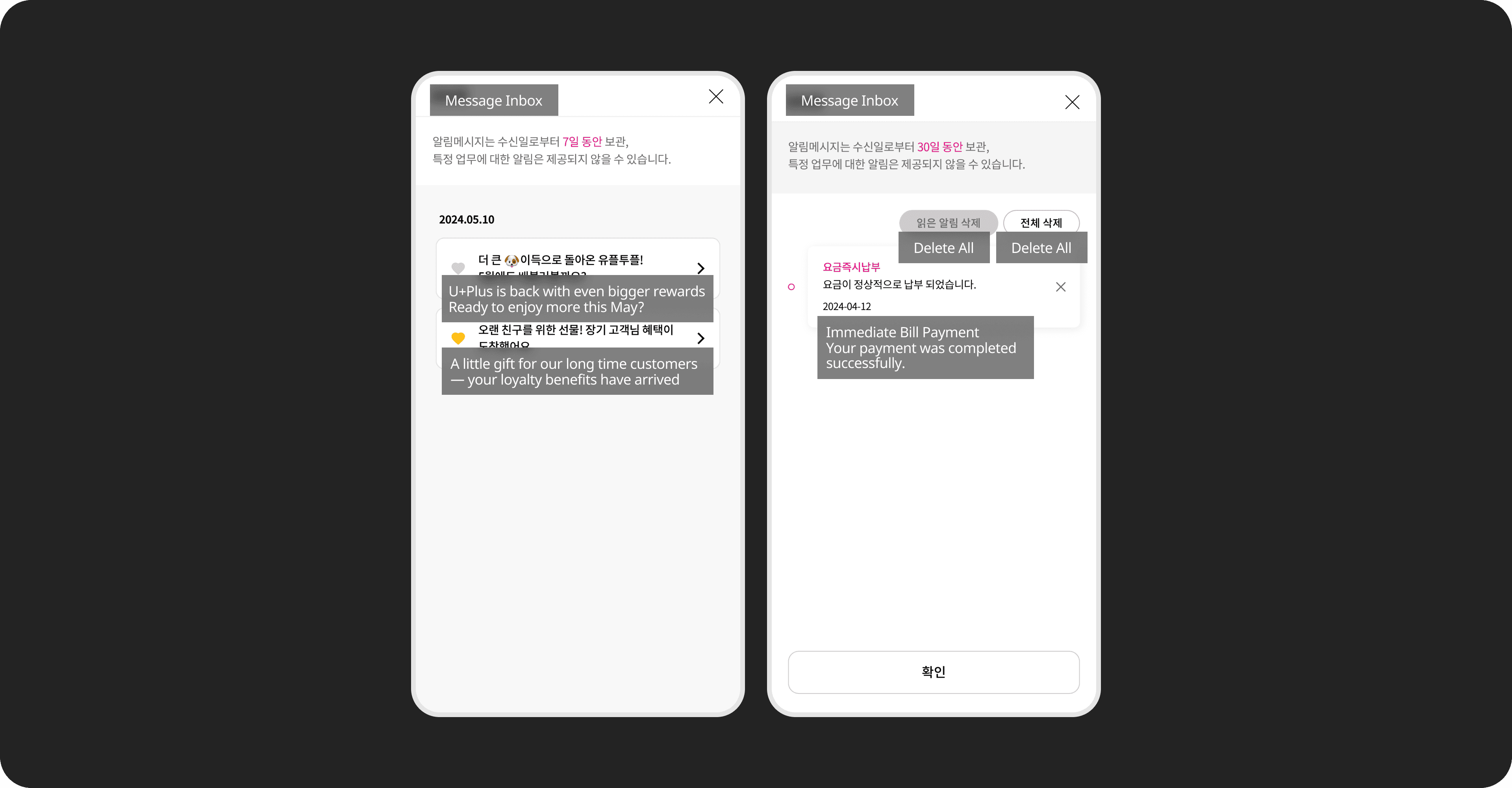
Notifications appeared in a single uniform list, making it hard to understand each message type or identify what was relevant. Users also struggled to retrieve past records such as previous bill payments or delivery updates.
Solution 3
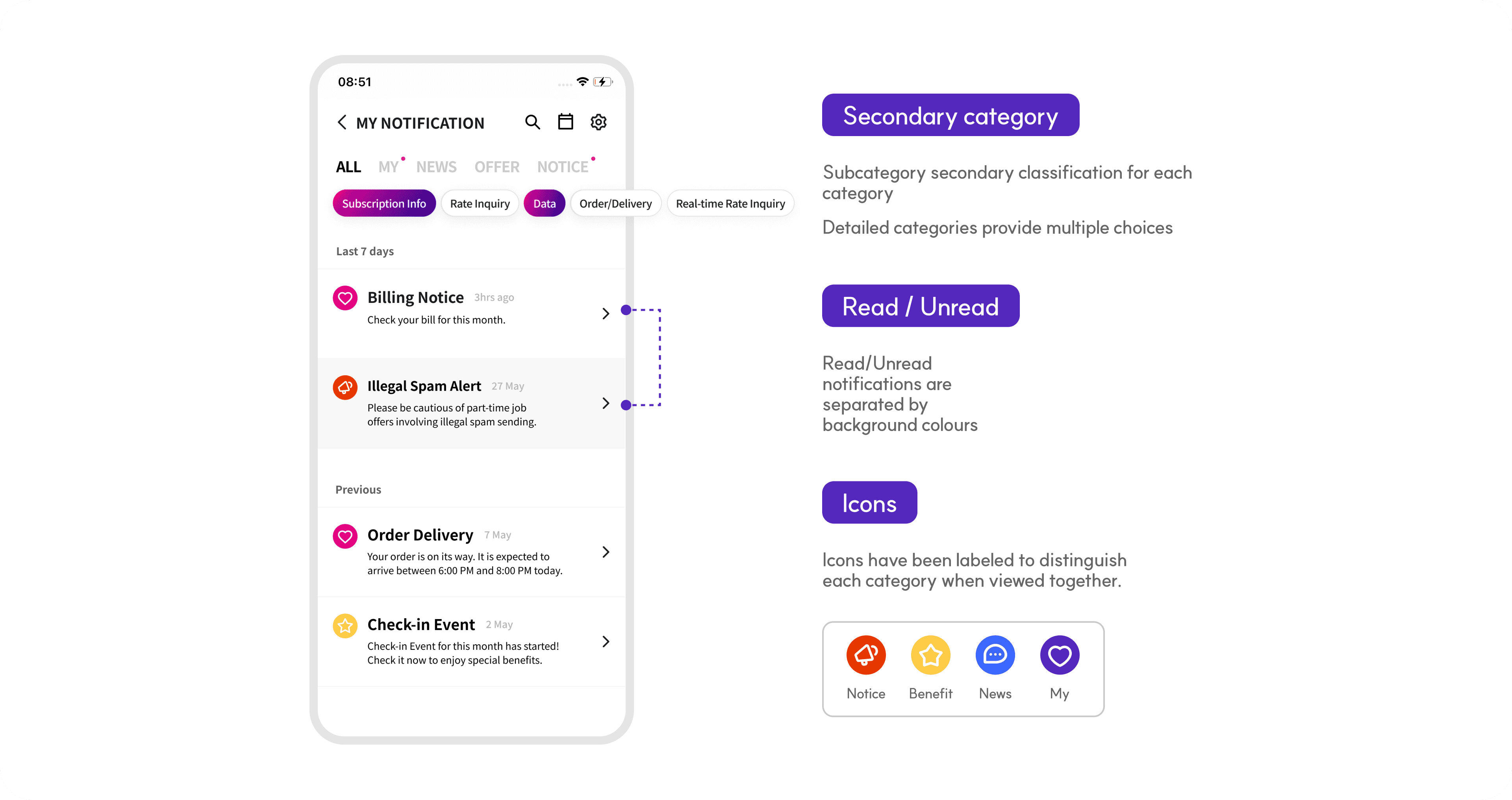
Structured notifications for easier navigation and self-service
Structured notifications for easier navigation and self-service
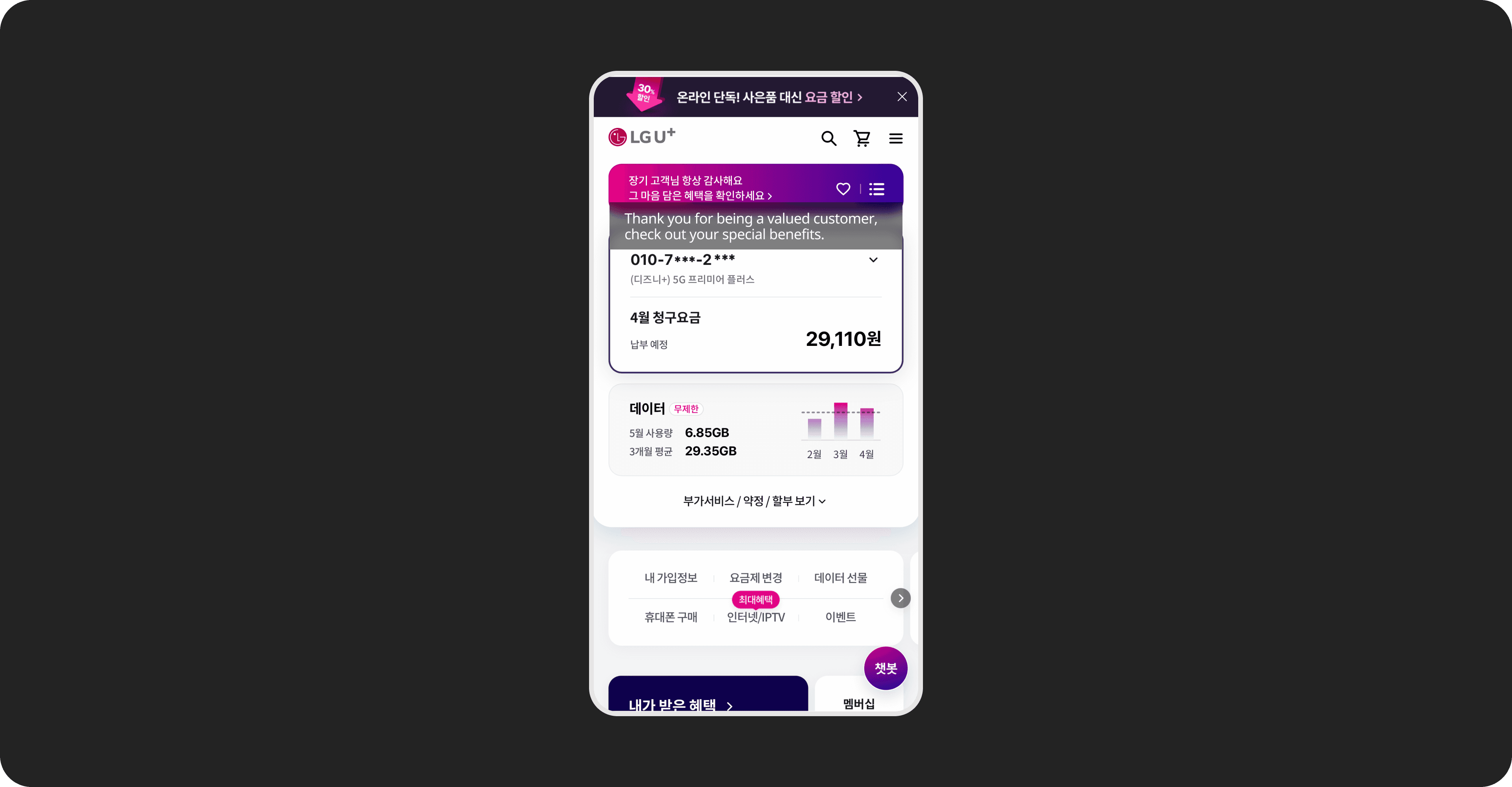
We introduced clear primary and secondary categories and refined message components to clarify each notification’s purpose. Messages were also linked to the relevant feature pages, enabling users to independently complete tasks such as paying bills, checking data usage, or tracking orders and deliveries.
Result
The redesign improved how users navigated and understood notifications, enabling them to find key information more quickly and complete more tasks directly within the app.
Perceived information-finding time High → Low
Notification clarity Low → High
In-app self-service attempts ↑ ~20–30%
Confusion from multiple entry points ↓ ~40%